Case study 01
Dr Sara
Khawaja
Pediatrician · Dubai
A digital presence that feels as caring, credible and considered as the practice itself.
 Visit the live sitedrsarakhawaja.ae →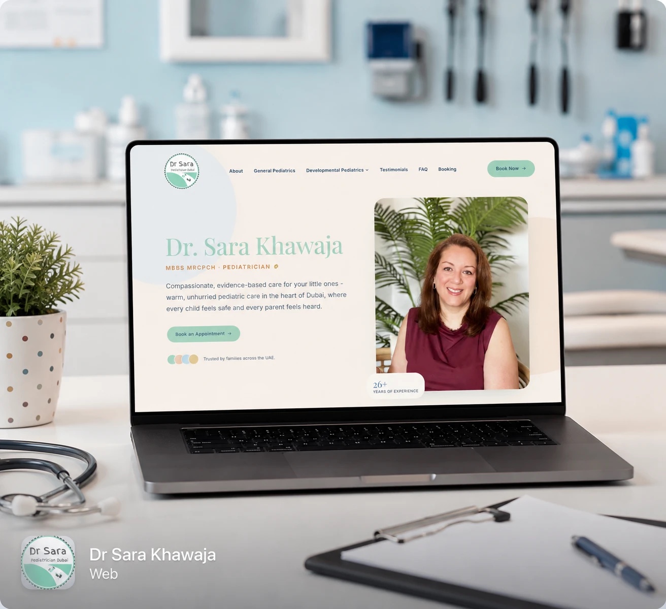
Not a website project. One connected presence, built from the business outward.
Calm, credible, and unmistakably hers.
Every element was chosen to feel professional to a parent and warm to a child, and to look like one family wherever it appears.
- 01 · #8ED4FFBlueA professional, calming and trustworthy foundation.
- 02 · #FBF1E7CreamAdds warmth and softness.
- 03 · #FFFFFFWhiteKeeps the identity clean and clinical without feeling cold.
A clear, friendly sans for everything a parent reads, with generous sizes and open spacing, so nothing feels clinical or hurried.
A soft, rounded mark in her blue and green: calm to a parent, friendly to a child, and legible at any size.
The star of the project.
Designed to make Dr Sara's expertise easier to understand, her approach easier to trust, and the path to contact her simpler.
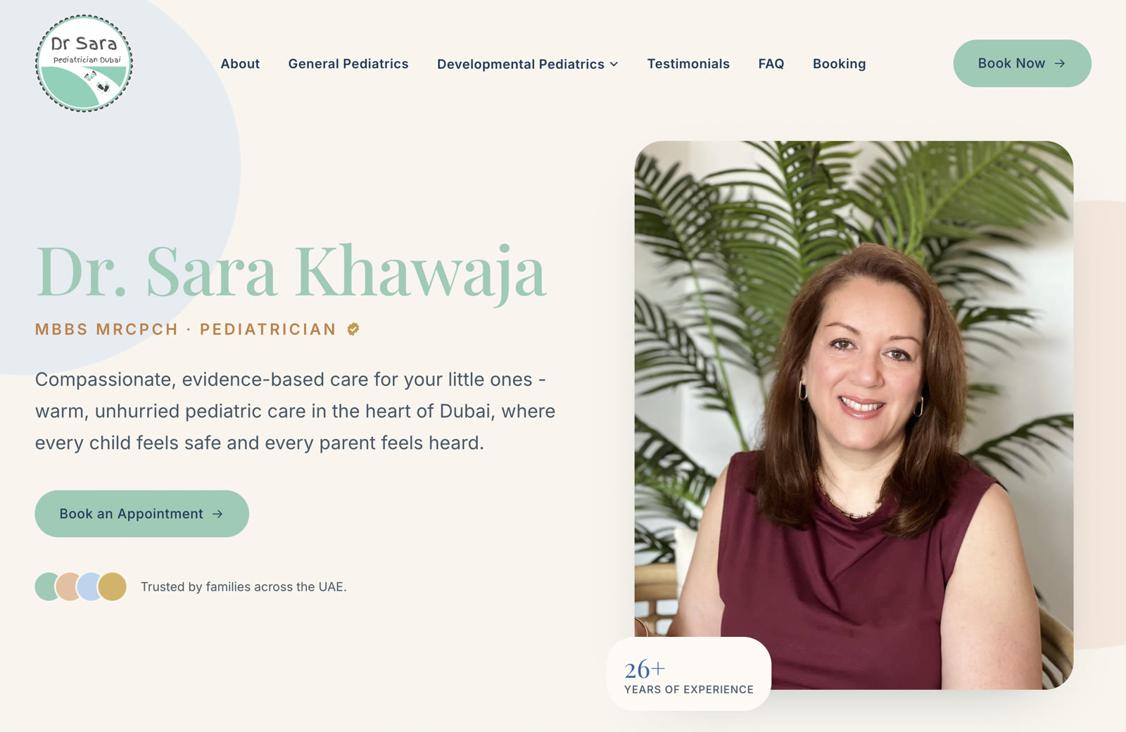
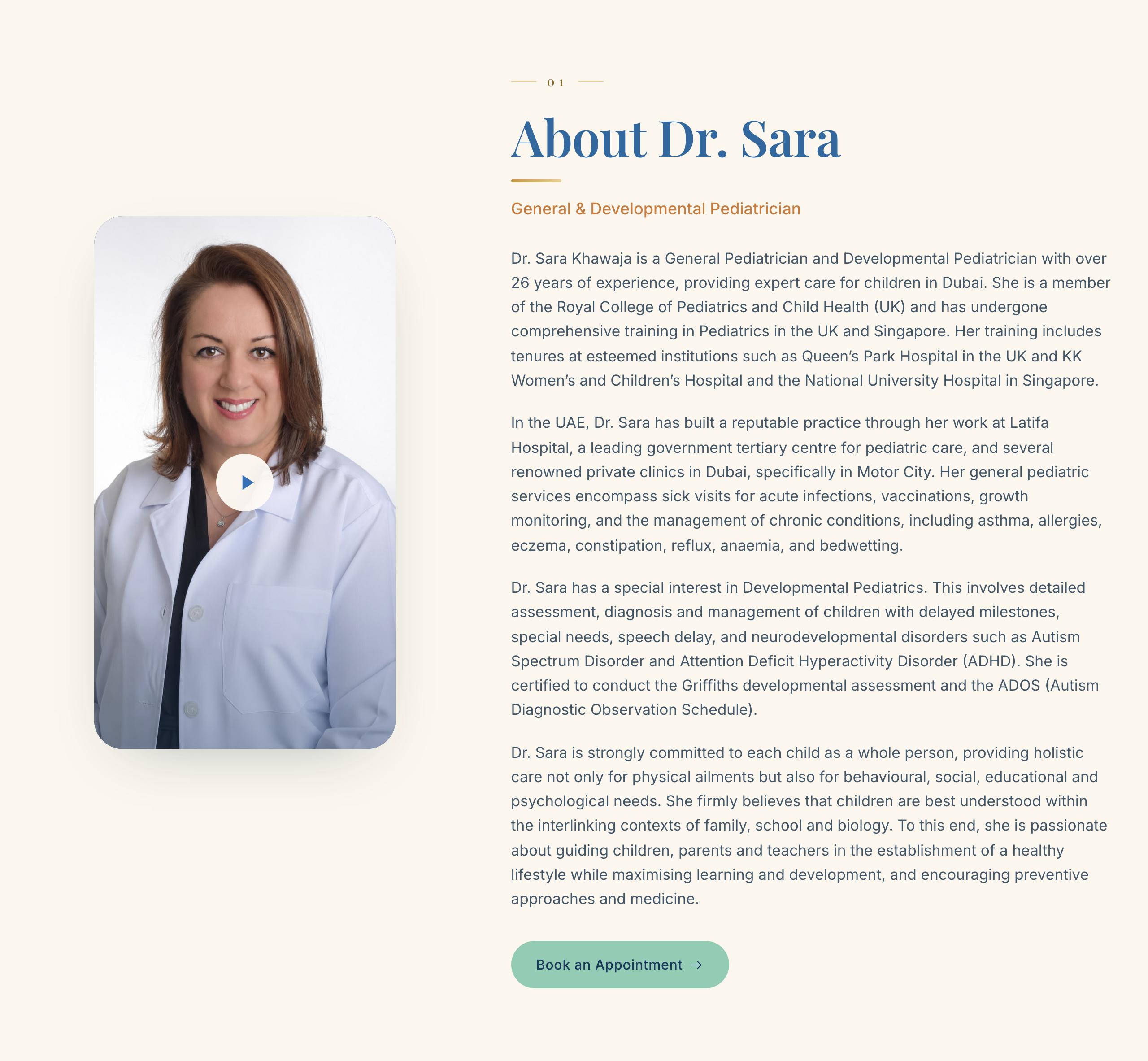
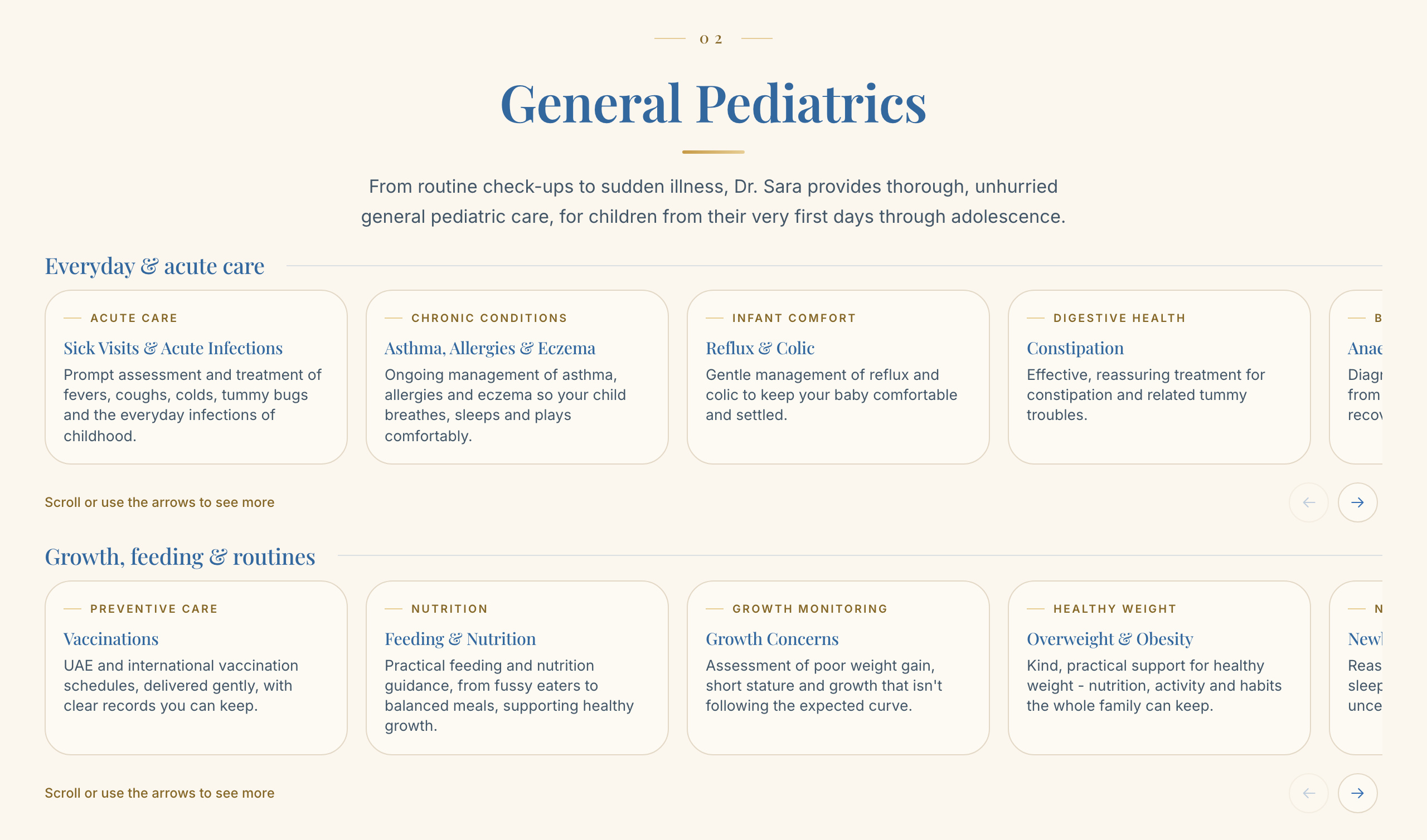
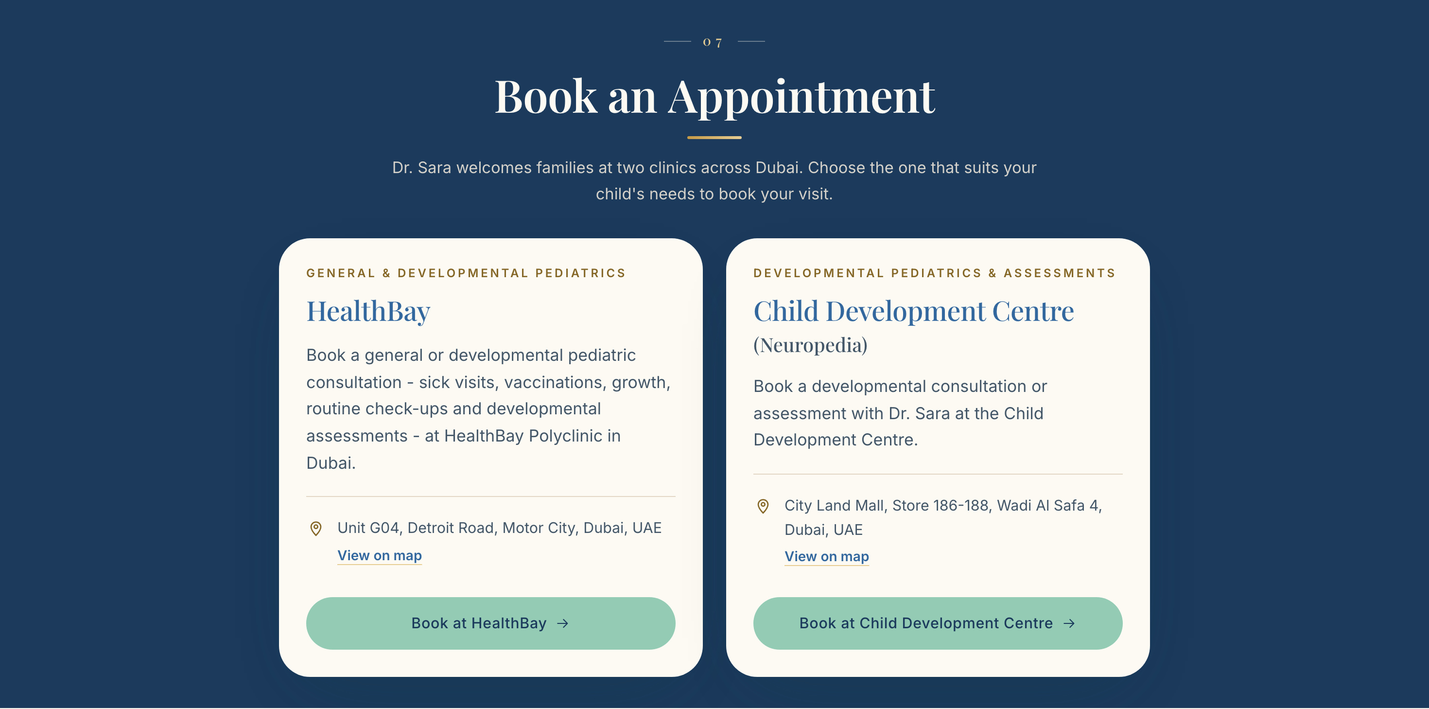
One brand. One digital presence. Every touchpoint connected.
An Instagram presence in the same identity, joined to the site so a parent can go from a post to a booking without the brand changing on the way.
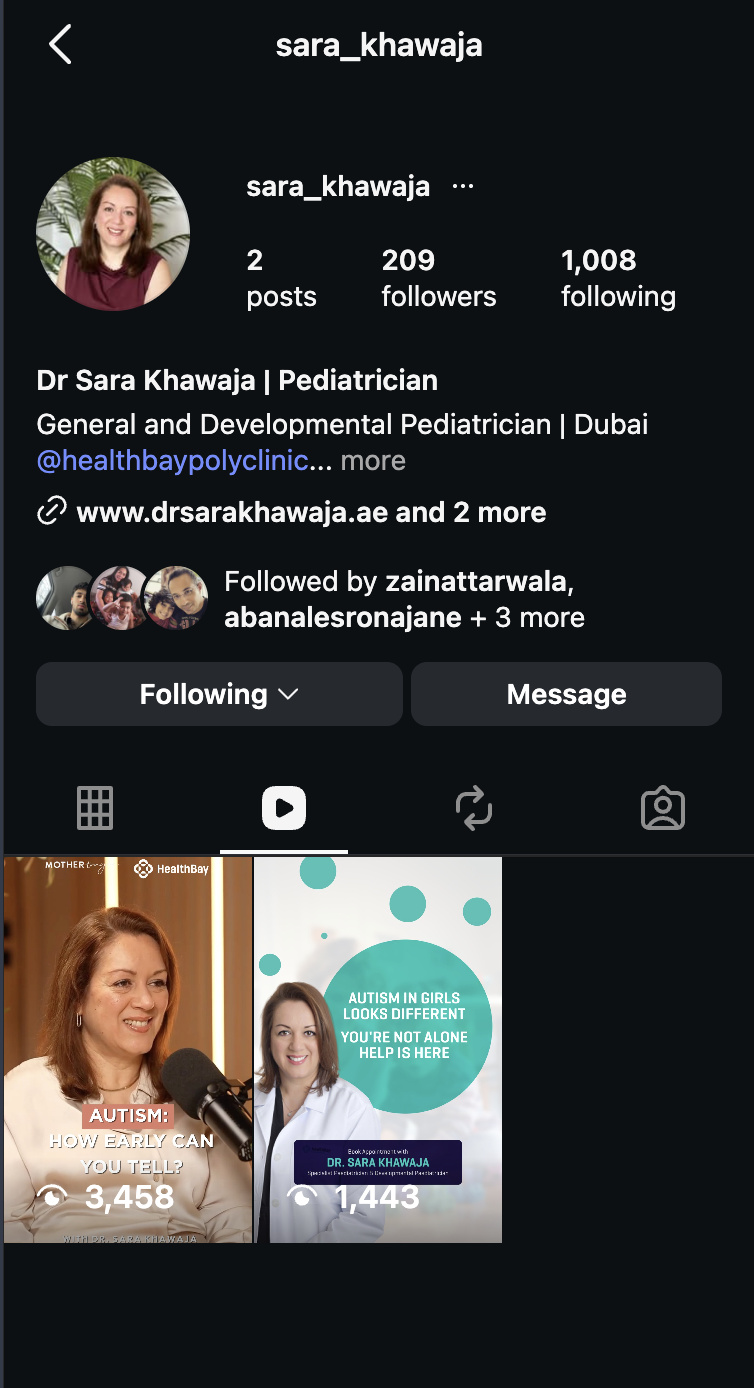
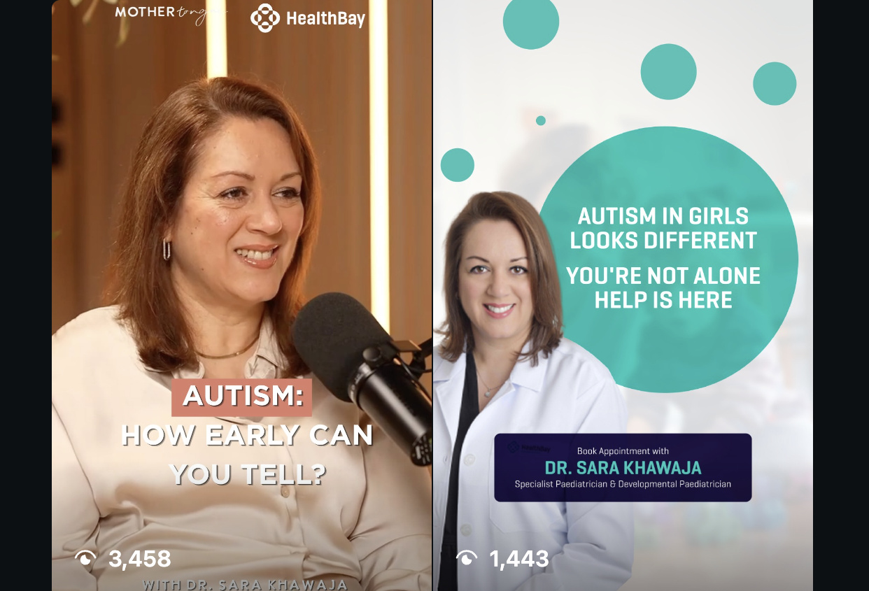
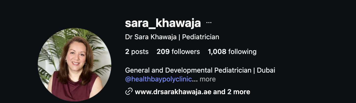
Nothing was designed in isolation.
The identity, the website and the social presence were built to feel like parts of the same brand.
- 01Logo
- 02Brand
- 03Website
- 04Instagram
- 05Digital presence
A better digital presence doesn't just look better. It changes how a business is understood.
Dr Sara's new identity and digital presence were built to make that understanding clearer, more credible and more connected.