Case study 02
ZAYMAR
Luxury fragrance · Dubai
A modern house of oriental and gourmand fragrance, built to be desired before it is even smelled.
 Visit the live sitezaymar.ae →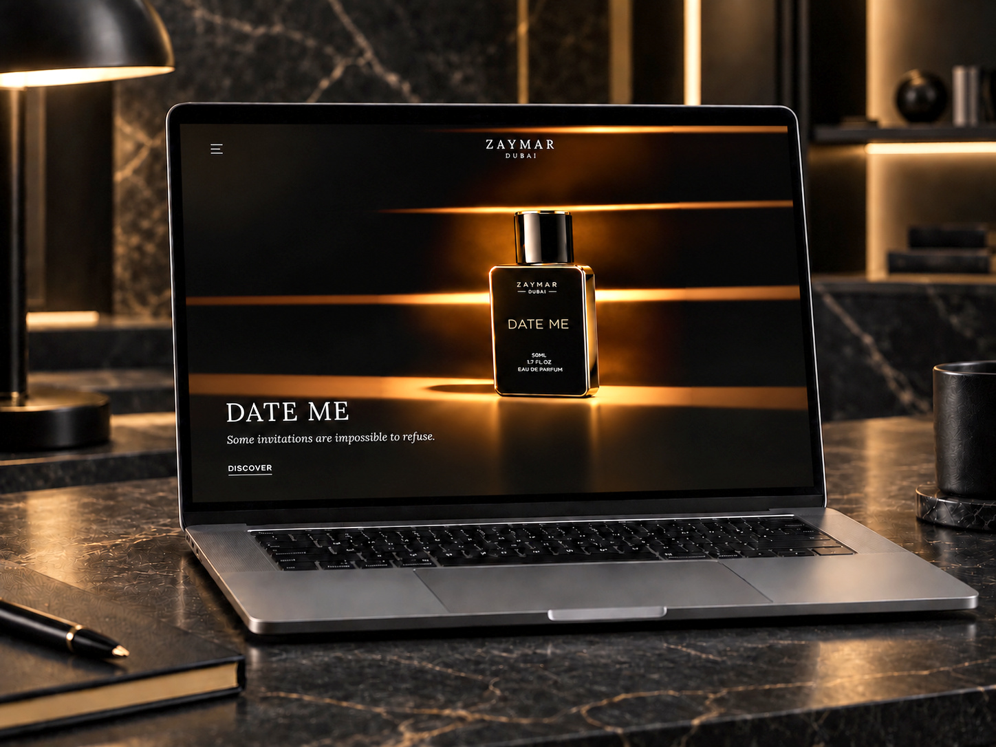
Not a website project. One connected presence, built from the business outward.
Dark, warm, and unmistakably ZAYMAR.
Every element was chosen to feel expensive and quiet: black for depth, gold for the detail, white for what matters.
- 01 · #0A0A0CBlackThe environment: depth, mystery and quiet luxury.
- 02 · #C9A35AGoldThe detail: warm, refined, never loud.
- 03 · #FFFFFFWhiteFor what matters: the name, the words, the breathing room.
A classical serif for the name, letterspaced and unhurried, with a plain grotesque for everything else, so the mark stays the only ornament.
A single gold flame rising from oud, over the name in a classical serif: the mark carries the whole idea of the brand in one shape.
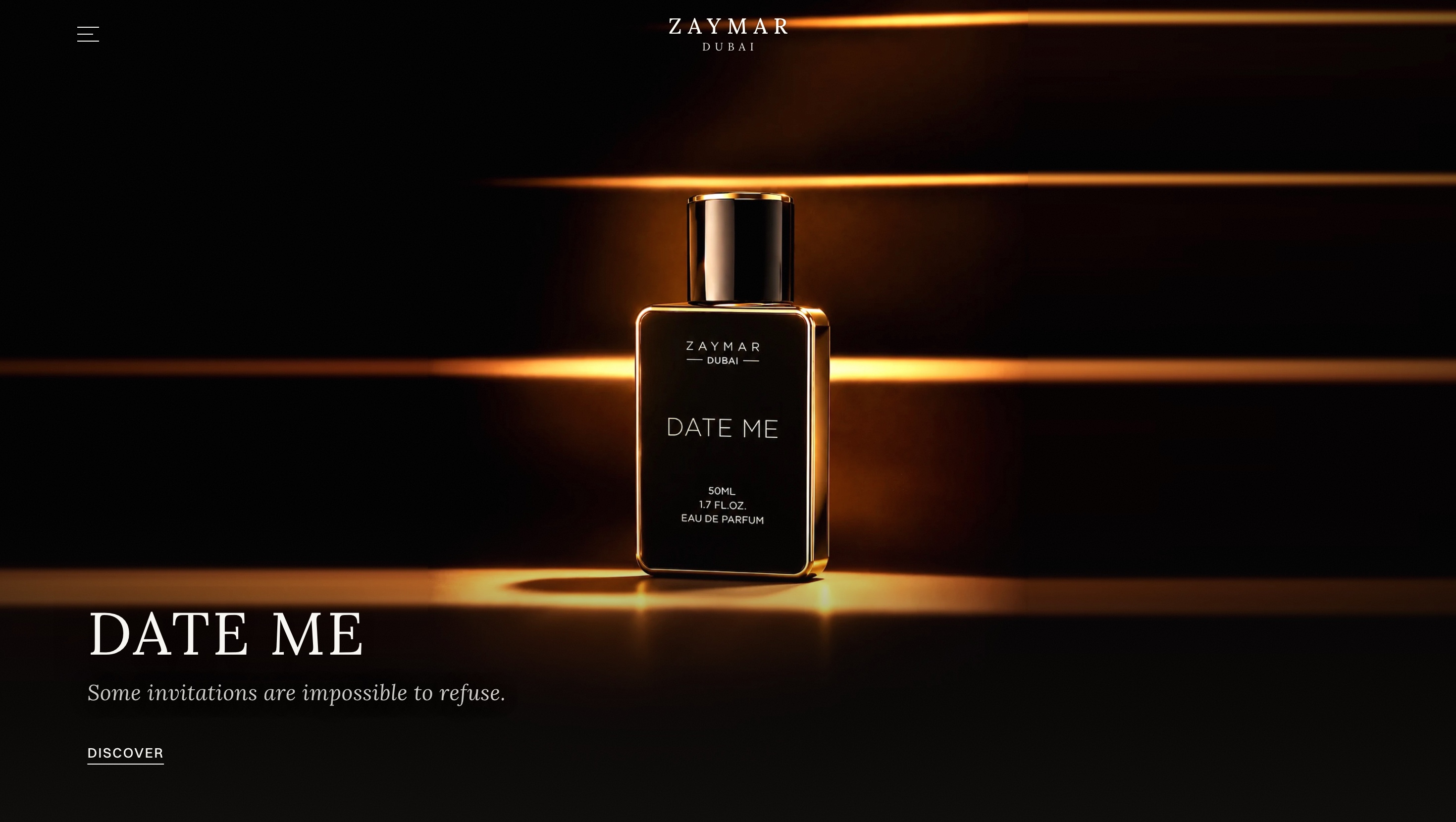
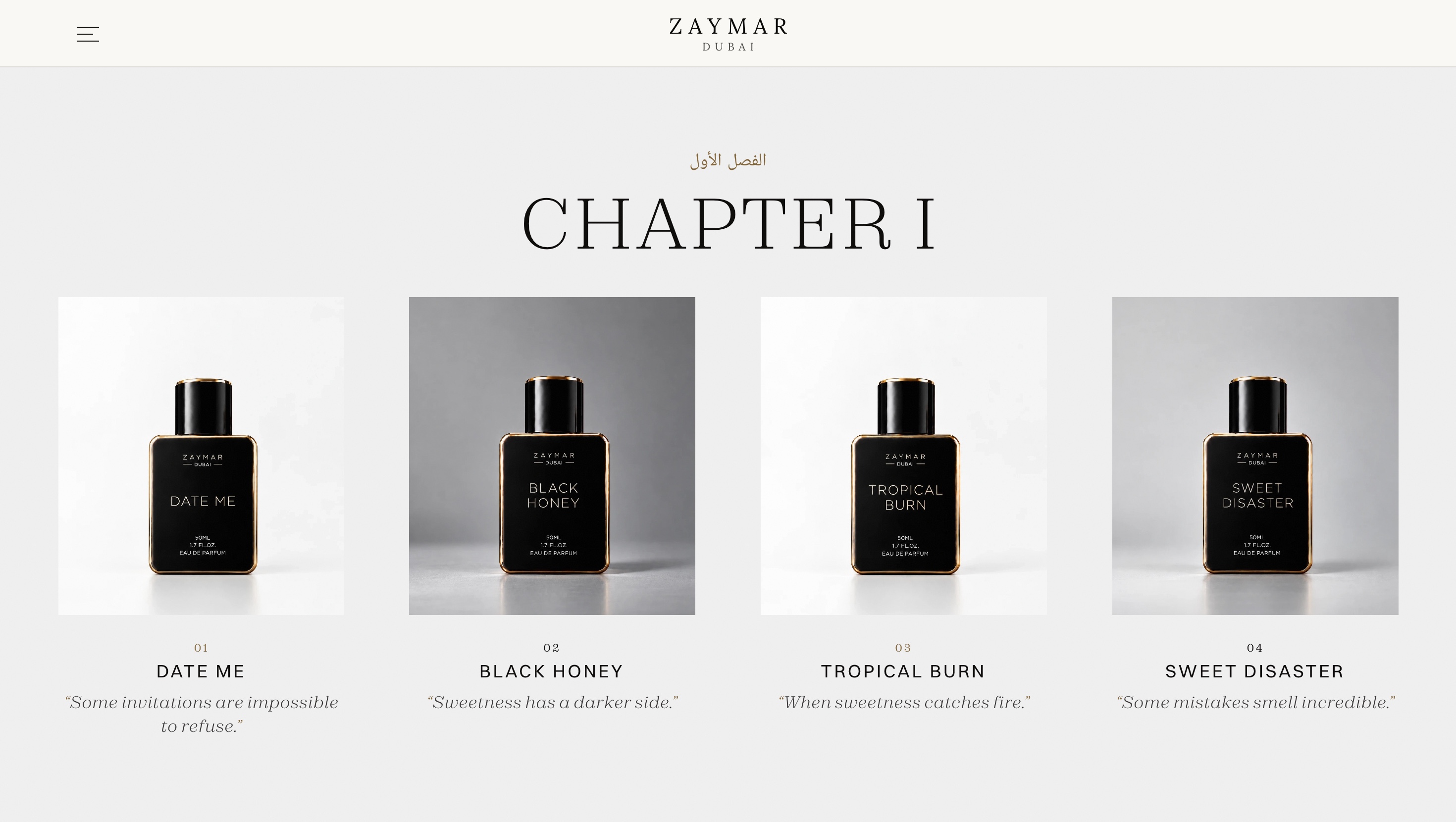
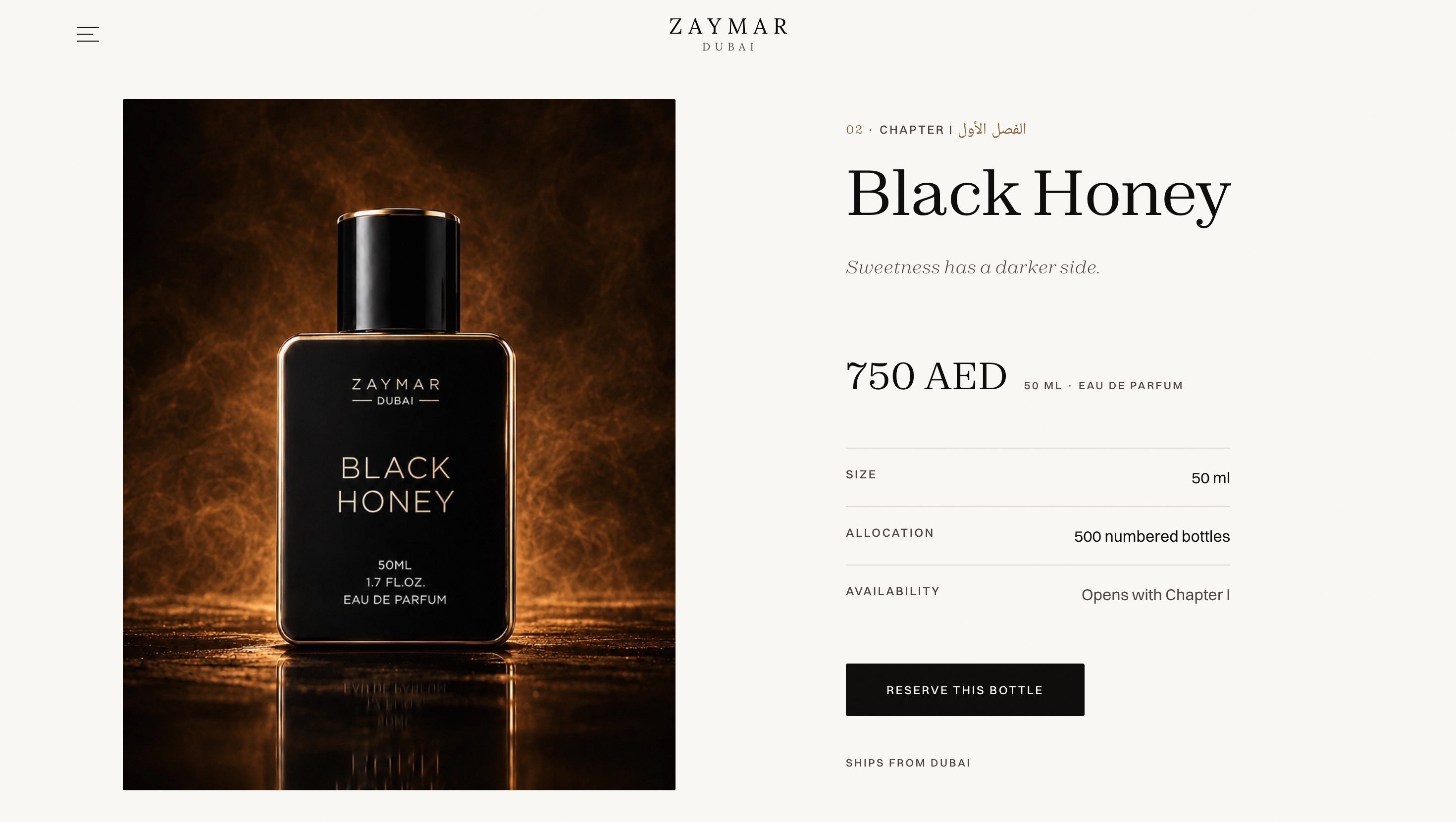
The brand world, on screen.
Designed to feel like the brand itself: dark, slow and precise, with each fragrance given its own light and a single quiet way to enquire.
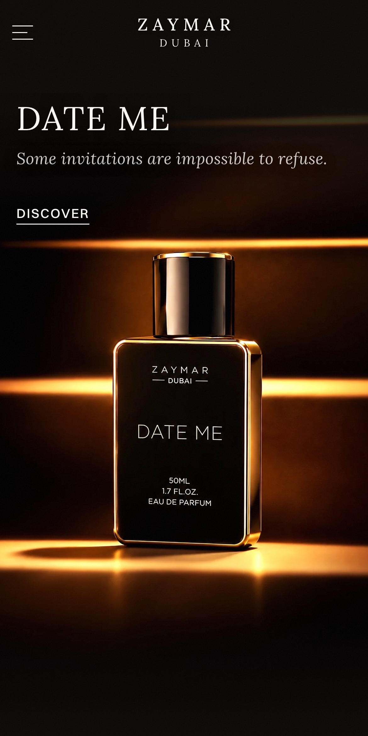
The same world, in the palm of the hand.
The same home page hero, as it opens on a phone.
Nothing was designed in isolation.
The strategy, the mark, the website and the packaging were built to feel like parts of the same world.
- 01Strategy
- 02Identity
- 03Logo
- 04Website
- 05Experience
Luxury is not what you show. It is what you make people want.
ZAYMAR was built so that every touchpoint, from the first screen to the open case, makes the same quiet promise.